I know that designing a kitchen can be a rewarding experience. But
for a 'first-timer', it could be daunting. There are so many layers of detail
that must work together to create a fine-tuned 'Dream Kitchen'. With all that
is going on at one time in a kitchen renovation, it is easy to get overwhelmed,
overlook something and make a mistake (whether it be big or small) that could
change that Dream Kitchen into a Kitchen Nightmare. Well, House Beautiful has compiled an interesting list of
suggestions from kitchen designers with some Do’s and Don’ts of Kitchen
Design.
Here are just a few of their suggestions:

Do: Have one element that's fun or
creative. Don't: Be boring
"The best kitchens have a soul or a
spirit that's warm, inviting, and personal," designer Mick De Giulio says.
"Every project is a chance to do something new and creative. It's not just
about the cabinets and countertops — the whole room has to sing." Adhering
to that principle, he updated an Illinois
kitchen in an old barn by keeping
the architecture of the horse stalls, adding a tongue-in-cheek stovepipe to the
range, and installing a pot rack that resemble a wagon wheel.

Do: Take cabinets up to the ceiling.Don't:
Have cabinets that fall short of the ceiling.
"They collect dust and un-needed
accessories," designer Joan Schindler says. In this Connecticut
kitchen, cabinets are full height and create the maximum amount of storage,
while glass fronts keep the space feeling airy. The panes are restoration
glass, which is uneven. The cabinets are painted Decorators White in semigloss
by Benjamin Moore.

Do: Know when to stop.Don't: Overdo
it.
"It drives me crazy when a kitchen is
over-designed. Knowing when to stop is the real challenge," designer
Christopher Peacock says. He used restraint in designing this New
York kitchen, achieving a soft, mellow look by using old wood floors and
vintage marble counters. The Country Kitchen sink is paired with the Amarillis
Heritage faucet, both by American Standard.

Do: Use cabinetry to conceal some
appliances. Don't: Go overboard
with stainless-steel appliances.
"Stainless steel can be a wonderful
accent. However, as with all good design, there should be a rhythm with the
placement. Splashes of stainless all over the place make any kitchen look and
feel choppy and small," kitchen designer Matthew Quinn says. For this
kitchen in Atlanta

Do: Make a small kitchen work for you. Don't: Think bigger is always better.
"A well-designed kitchen with
high-quality materials and thoughtful details can make even the smallest space
suit you perfectly," designer Tish Key says. In this compact California

Do: Leave some space to breathe. Don't:
Go overboard with storage and fill the walls with cabinets.
"There's rarely a need to completely
fill a room with cabinets. A good layout is a balancing act between storage,
function, and aesthetics," designer Robert Bakes says. In this New
York kitchen he designed with Cecil Baker, open space above the sink means
there's room to breath. Viking
range and Sub-Zero refrigerator.
Cabinet pulls from Doug Mockett & Co.
Do: Invest in strong and good-looking
cabinets. Don't: Skimp on
poor-quality.
"Think about it — you're opening and
closing those doors and drawers all the time. Get something strong and
good-looking. Hardwoods, a good finish, and strong hinges are essential,"
kitchen designer Beverly Ellsley says. In this French-inspired
Connecticut kitchen, all of the cabinetry is of her own design. The
intricate woodcarvings are from Ellsley's Villa Collection for Enkeboll Designs.
Do: Have a countertop around the oven walls. Don't: Put a oven off by itself.
"Where
are you going to put the turkey when you take it out of the oven?" points
out kitchen designer Terry Scarborough. For a Connecticut
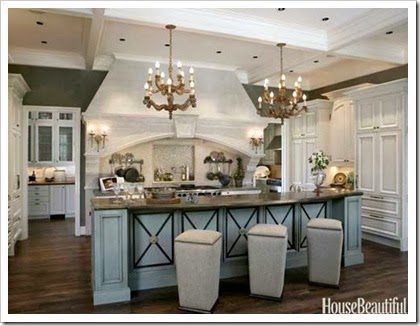
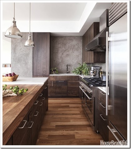
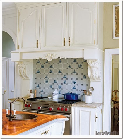
Let me know which kitchen image above is your
favorite? Did it ‘speak’ to you?
Do you know what design style it would be?


