Welcome to All in the Detail... I am so glad you are here!
I have said over and over that there really is no right or wrong when it comes to design, personal taste is the defining factor. But I do have a few personal ‘pet peeves’ when it comes to decorating with color.
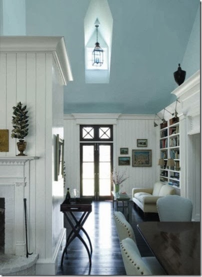
Ceiling Paint
Never
paint a ceiling dead white (i.e. when you paint, remember there are 5 walls,
not just 4) because all white paint has a bit of gray in it, and that color (gray) takes the room
down in energy. Instead, if you don’t want your ceiling to match the walls,
paint it a cream shade (or warm white). P.S. Never, ever stipple a ceiling;
smooth ceilings always pass the test of time.

Matching Shades
Never
match your walls exactly to a color in your fabrics. This most likely will be
too strong and deep of a color for an entire space such as walls. Find a
lighter version of that color. Take a sample of your fabric to the paint store
and match it to a color strip… then move up the strip at least one or two
shades to find a coordinating color. The paint store representative can be a
great help here – always ask, that’s why they are there!
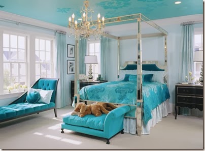
Neutral Balance
The
biggest mistake people make when they are trying to be colorful and exciting
with their decor is to forget that they need to balance it with neutrals –
otherwise it ends up looking like a color wheel. Repeat after me “pops of colors and a neutral balance” “pops
of colors and a neutral balance” “pops of colors and a neutral balance”
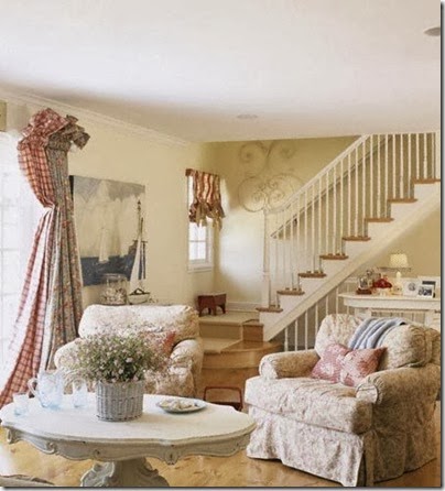
Continuity
Even
when I don't use the same colors throughout the house, I like the rooms to feel
connected. The bedroom should never feel like it's in a completely different
'style' home than the living room – the whole house has to make sense as one.
It’s your personal taste and obviously your taste should be reflected
throughout the house, right? Carry a common design thread throughout (“Knowing
your design style”
is key here).
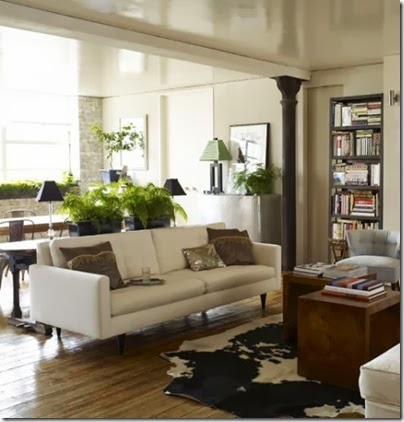
Contrast
One
of the biggest mistakes people make with neutrals is not using enough contrast.
A room of cream and beige needs something stark and shiny white and something
dark. You have to interject elements that add intense personality and depth to
a room. Make it gutsy, or else it becomes boring.
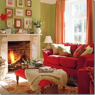
Don't Go Overboard
When
any color scheme is taken too seriously, it loses power. You need to know when
to pull back. A two-color scheme can be great, but there has to be some relief,
or it comes across as a “Rooms to Go” purchase (You know what I mean, “I’ll
take that complete room display”).

Picture Yourself in the Space
People
don't take into account how they'll look in a room when choosing a color. I
just did an apartment where the woman has blue eyes with a bit of a purple tint
them, so everything worked with shades of lavender to purple. Now she simply
glows at home. Look in your closet… what articles of clothing do you get the
most compliments on when you wear them?
Let a Room Evolve
When
it comes to color, I say, 'Go big or go home.' You have to trust yourself. But
you don't have to commit to color all at once — you can play with it as the
rooms evolve. Start with one palette and then mix things in. Baby steps are the
best direction when stepping outside of your comfort zone… you have to live
with it so gradually get used to it.

Choose the Right Finish
Darker
colors in general can read very flat, so use a high-luster finish. Good prep is
key to any high-luster paint finish, so skim-coating the walls can really help.
If the walls are well prepared, you can get a deep, rich gloss without going to
the expense of lacquering. An old misconception: Everyone can paint. A layman’s
paint technique/quality and a professional’s paint technique/quality are worlds
apart and it shows! Always pay to get the extra help if you are going bold.

Depth
Deep
colors contain many other hues, and you have to be just as concerned about the
secondary shades that you blend in. Colors that have no depth are oddly
fluorescent. They will leap out at you, rather than pull you in. It's a subtle
difference, but failure to recognize it can be what makes people afraid of
using color.


